There’s a small-ish cluster of serif fonts—all of recent design, not digitizations of classic typefaces, nor even designed for (professional) print1—that people always have trouble fitting into one of the traditional categories of serif typefaces.
In appearance, it looks something like if Baskerville, a 225-year-old typeface that has been shown to shape our perception of truth, and Caecilia made a baby.
These fonts are sort of like transitional serifs, but they’re also sort of like slab serifs, and sometimes they’re called “transitional serif but with features of a slab serif”2 etc. etc.
… a crisp, modern serif typeface … avoids the stuffiness of historical text faces and doesn’t overreach when it comes to contemporary detailing … a balanced, low-contrast typeface with economic proportions…
Fonts in this category share these properties:
- fairly thick strokes in the normal weight
- low stroke weight variation
- serifs that are not sharply tapering nor thin and dainty, but thick (yet not geometric or square, as slab serifs)
- relatively open counters
- relatively large x-heights
… simply a contemporary body text font.
Fonts in this category include:
… and quite a few more more—see the full list (that I’ve found so far) on my wiki (and feel free to suggest additions on the Talk page!).
Some samples:
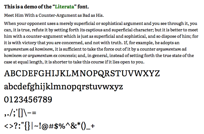 Literata (click to enlarge)
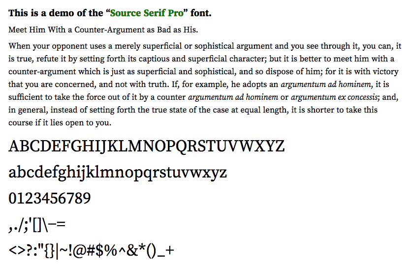 Source Serif Pro (click to enlarge)
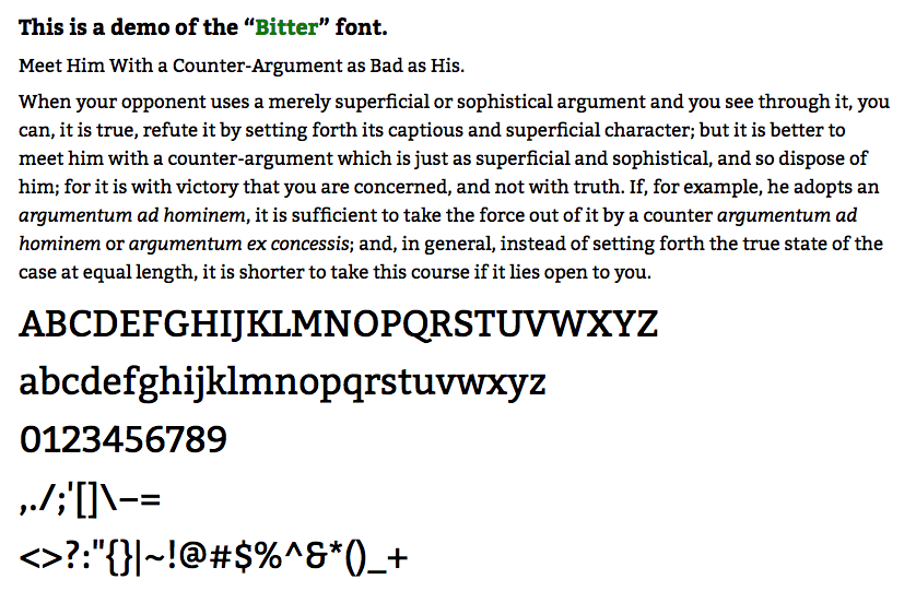 Bitter (click to enlarge)
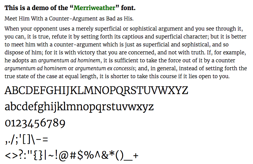 Merriweather (click to enlarge)
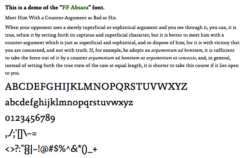 FF Absara (click to enlarge)
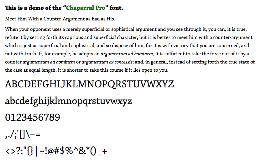 Chaparral Pro (click to enlarge)
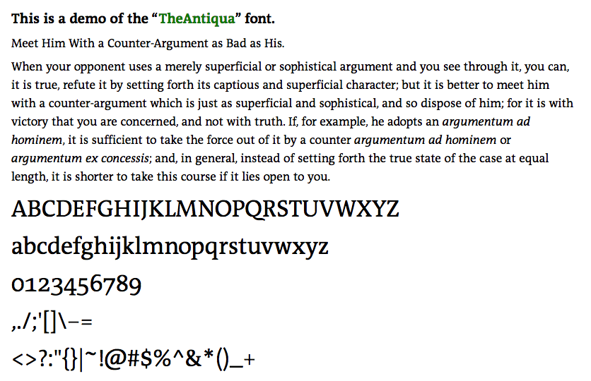 TheAntiqua (click to enlarge)
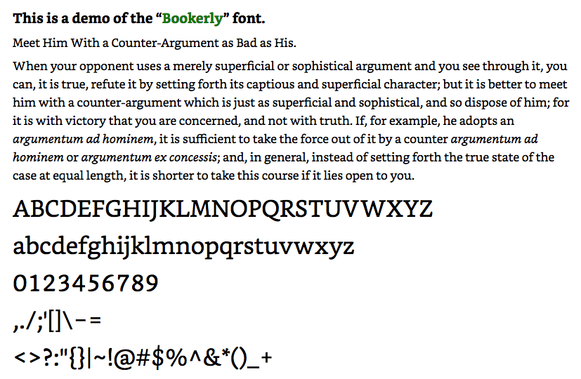 Bookerly (click to enlarge)
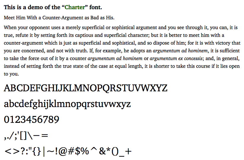 Charter (click to enlarge)
The category does not seem to have any accepted name3—yet unquestionably this is a real cluster in font-space. This blog post is meant to call attention to the cluster’s existence.
The characteristics listed above mean that fonts like this will render well across a variety of environments, software and hardware. And empirically, these fonts make for pleasing and readable body text on the web. So, at least for now (unless and until someone tells me that there’s already an accepted name), I’m calling these fonts “screen serif” fonts.
If you want your pages to be readable and attractive, try setting your body text in one of these fonts! (Again, check out my wiki for the full list—I’ll be adding more “screen serif” fonts to it as I come across them.)
1 Some of them—notably including the oldest font I’ve found that belongs to this category, Charter—are designed for consumer printing situations, i.e. laser or even inkjet printers. ⇑
3 It’s not the same as Clarendon-type fonts—though there is a good bit of similarity. In fact, Fonts.com includes Charter in the Clarendon category, but that seems to be a minority view. ⇑
Recent Comments