(Previously: BigVTT project update #1: data format considerations)
The first of the requirements for BigVTT—indeed, the motivation for the entire project—is “large map support”. We’ve already established that we’ll be basing our map file format on Scalable Vector Graphics (SVG), which should allow us to support maps of arbitrary size1; and it should be simple enough to design BigVTT’s UI so as to support any dimensions and scale for the battle grid, map image, etc.
But is that enough? Does “large map support” consist merely, literally, and simply, of allowing maps of any size?
Perusing the brief reviews of existing VTT software shows pretty clearly that the answer is “no”. Said reviews are full of comments like these:
For one thing, the zoom function only goes down to 10%. But 10% of 851,200px is 85,120px. Who has a display that big? I certainly don’t. Being able to view, at most, 2% of the map on the screen at any given time is, obviously, horribly unwieldy, to the point where doing anything useful with such a map is impossible. There’s also no way to quickly move the view between distant parts of the map.
Large map sizes can be set, but then you can’t zoom in far enough to even see the individual grid squares, much less make any kind of use them by placing tokens or what have you.
Can’t zoom out to further than 50%.
I might be tempted to try using a statically upscaled map (despite the egregious file size required by this)… except that it is in any case impossible to zoom out to see the whole map of this size, and there are (as usual) no affordances for working with maps this large. (There is not even a zoom level indicator!)
And so on, and so forth.
In short, the mere ability to set a very large map size is not enough—the range of possible map sizes has to be integrated, in conceptual and interactional terms, into the design of the VTT, in a comprehensive way. To put it another way, there must be a robust set of affordances for working with very large maps. (And, of course, we will have to pay careful attention to ensure that we haven’t made it harder to work with maps of more ordinary sizes, either.)
Let us now examine in detail some specific program features and design considerations that are implied by this principle.
Contents
Zooming
This is a big one.
Zoom is a feature common to a wide variety of applications and tools, from page layout programs to CAD software to bioinformatics visualization packages to mapping/navigation tools. As a basic concept, it’s simple enough. We would like:
- the ability to see our entire document (or data set or whatever is the entirety of the thing that we’re working on) on the screen at once, as a “high-level overview”
- the ability to examine our data or object(s) at the lowest level, at a visual scale sufficient to both clearly see and effectively interact with every data element that has any meaning in the system
- the ability to adjust the visual scale freely, switching between the above two scales, as well as any intermediate scale that may meaningfully be specified
The range of contexts in which these basic requirements apply is vast. We can add other desiderata, of course—but if you don’t have at least these three things, then you don’t have a zoom feature.
Zoom range
Translating the above to the specific context of a VTT, we want to be able to:
- zoom out far enough to see the whole map on the screen at once
- zoom in at least far enough to see tokens on the screen at full image scale
- we may wish to be able to zoom in somewhat further than that, depending on, e.g., whether the VTT also provides map editing features, whether the VTT features “map objects” on a sub-grid-square scale, etc.
- freely adjust the zoom level between the above two extremes
These, again, are the very basics—the fundamental motivations for having a zoom feature in the first place. And yet, in a frankly shocking fraction of the VTT apps I reviewed, the zoom feature fails to provide even that core functionality!
So the first and most basic requirement for BigVTT’s zoom feature is simply that it should have a full zoom range. The minimum zoom level should be as small as needed to see the full map on the screen at once. The maximum zoom level should be… well, we can return to this question that when we design our map editing tools, and various other features; but for now, let’s say that it should be 200% (i.e., big enough to see tokens at full image scale—which would be 100%—and then double that, just in case).
Let’s look at an example. On Roll20, the maximum zoom level is 250% (where “100%” means that the map will be displayed at a scale of 1 display pixel per map pixel, at whatever grid size in pixels is configured in the map settings; 70px per grid square is the default), and the minimum zoom is 10%; this is a zoom range of 25×.
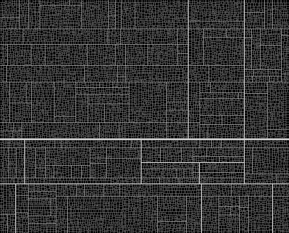
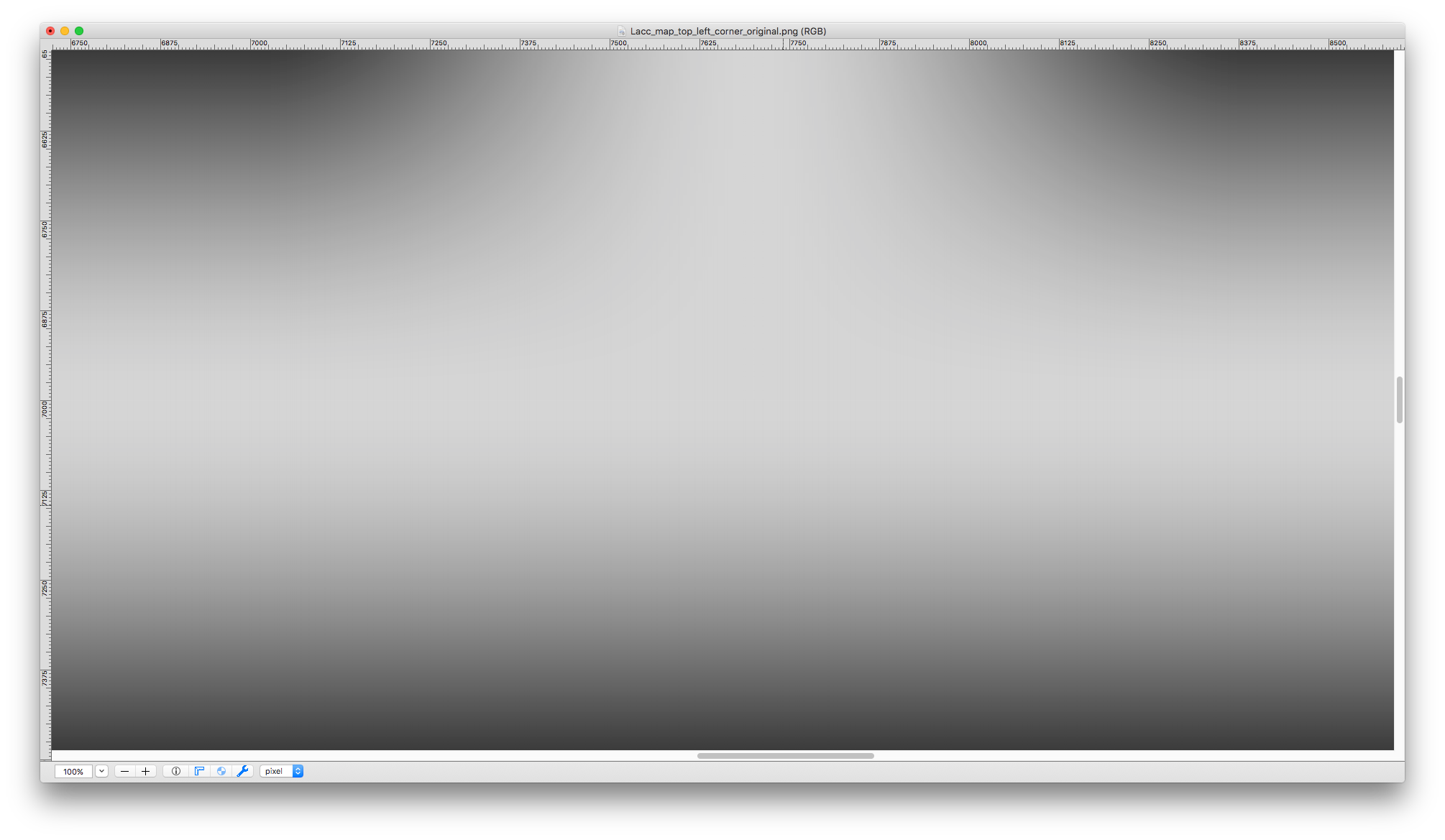
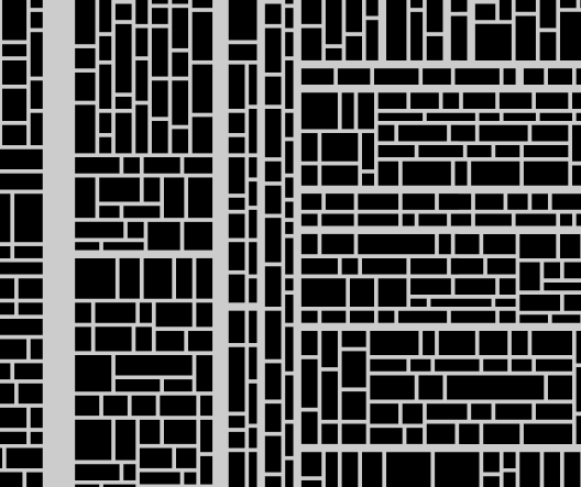
Now, consider our example map for an arbitrary rectangular section of Lacc, the City of Monoliths. The map represents an area 12,160 × 9,820 grid squares in size. Let’s keep the maximum zoom level at 250%, and the grid scale at 70px per square. What would be the minimum zoom level, to fit the whole map in a 1216×982px viewport? That would be: 1216 ÷ (12,160 × 70) = ~0.00143, or ~0.143%. The total zoom range would thus be 250% ÷ 0.143% = ~1748×.
In other words, the zoom range of Roll20 is seventy times too small to properly support the use of a map this large. (Well, we might cut down the maximum zoom level from 250% to 200%, which gets us down to a mere fifty-six-fold mismatch. But a moment’s thought reveals that this is not actually an improvement, even a small one—after all, the minimum zoom level is unchanged! This is a good reminder that while the zoom range, as such, is a good proxy measure of what we’re aiming for, it is not actually identical to our desiderata for the zoom feature. The minimum and maximum zoom levels must independently match our requirements, and it does not suffice merely for the difference between them to be large enough.)
Some obvious design mistakes to avoid:
- setting the maximum zoom level to be some fixed multiple of the minimum zoom level (e.g., designating “the whole map is on the screen” to be “zoom level = 1”, and then setting the maximum permissible zoom level to be 10)
- On large maps, this leads to not being able to zoom in far enough to see tokens
- the reverse of the above, i.e. setting the minimum zoom level to be some fixed fraction of the maximum zoom level (e.g., designating “the tokens are displayed at full image scale” to be “zoom level = 100%”, and then setting the minimum permissible zoom level to be 10%)
- On large maps, this leads to not being able to zoom out far enough to see the whole map at once
- setting a minimum or maximum zoom level as a function of map scale (e.g., setting the minimum zoom level to “10% of intrinsic image scale”, or the maximum zoom level to “200% of intrinsic image scale”)
- When using a map image with a large intrinsic size—which may be either very large bitmaps, or, more likely, SVGs with the values scaled to a large intrinsic size—this leads to not being able to zoom out far enough to see the whole map at once; conversely, when using a map image with a small intrinsic size, this leads to not being able to zoom in far enough to see the tokens
- setting a minimum or maximum zoom level as a function of grid scale (e.g., setting the minimum zoom level such that the display scale is 1 pixel per grid square)
- On large maps, this leads to not being able to zoom out far enough to see the whole map at once
Note that while keeping these sorts of specific failure modes in mind is always a good idea, this entire class of mistakes can be avoided by regularly and thoroughly testing the zoom feature (along with every other feature, of course) with maps of various sizes (up to as large a size as possible).
Testing aside, we can also notice that most (though not quite all) of the mistakes listed above stem from a fundamentally bitmap-oriented approach. We will surely be less tempted to make a mistake like “the maximum zoom level is 2× the intrinsic image scale” if we’re using vector graphics, for which the intrinsic scale is an essentially arbitrary choice, which is made for convenience and does not correspond to any fundamental properties of the represented image data. (We will revisit the topic of image scale pitfalls when we discuss map image scaling, later in this post.)
Zoom UI
How—that is, by means of what specific interactions—should the user actually be able to zoom the map?
Once again, Roll20 is an instructive example. There are several ways to adjust the map zoom level:
- while holding down the Option (Alt) key, scroll the mouse wheel up/down (or use the scroll gesture on a trackpad, etc.)
- hit the ‘+’/‘−’ keys
- drag the zoom slider up/down
- click the zoom level indicator and select one of the options from the resulting submenu (“Zoom In”, “Zoom Out”, “Zoom to Fit”, “Zoom to 10%”, “Zoom to 50%”, etc.)
- click the zoom level indicator and type a number into the numerical text field
This is pretty good! Multiple different ways to do the same operation, various specific options, support for both keyboard-based and mouse-based interaction—all fine. The only problem is that “while holding down the Option key” requirement. Now, on Roll20, which is designed for relatively small maps (at least, compared to BigVTT), and where zooming is much less of a big deal, this may be fine; but on BigVTT, it simply won’t do. Moving the user view around the map must be as seamless an operation as possible.
Is there some reason not to let the user use the mouse wheel (or zoom gesture) to zoom the map at any time, without having to hold down any modifier keys? Sometimes, yes! (We will examine this in detail when discussing the design of the drawing tools, for instance; that’ll be a later post.) But usually—no.
So the second requirement for BigVTT’s zoom feature is that it should be as low-friction an operation as possible. Ideally, the user should never, even for a moment, have to think about how to zoom the map—it should simply feel like a perfectly intuitive form of “direct manipulation”. (Needless to say, we will also add multiple different ways to zoom the map, similar to how Roll20 does it. But the highest implementation priority will be given to those parts of the zoom functionality which allow for frictionless, seamless, continuous zooming, via simple mouse/trackpad gestures and single-key commands.)
Zoom display
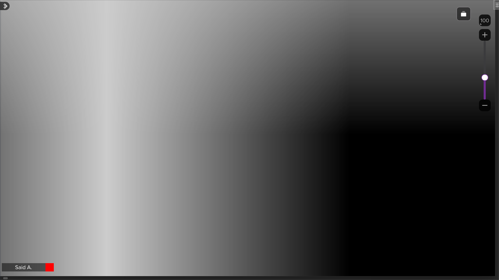
This one’s pretty basic: there should be a UI element that shows the current zoom level. (Hardly even worth mentioning, right? And yet: so many VTTs fail even on this basic point!)
Zoom origin correctness
This is a fairly subtle point, and easy to get wrong—but if we don’t get it right (and most VTTs don’t), then BigVTT’s zoom functionality will feel clunky, and will be objectively less effective (i.e., will take more user actions and more time to achieve a desired result).
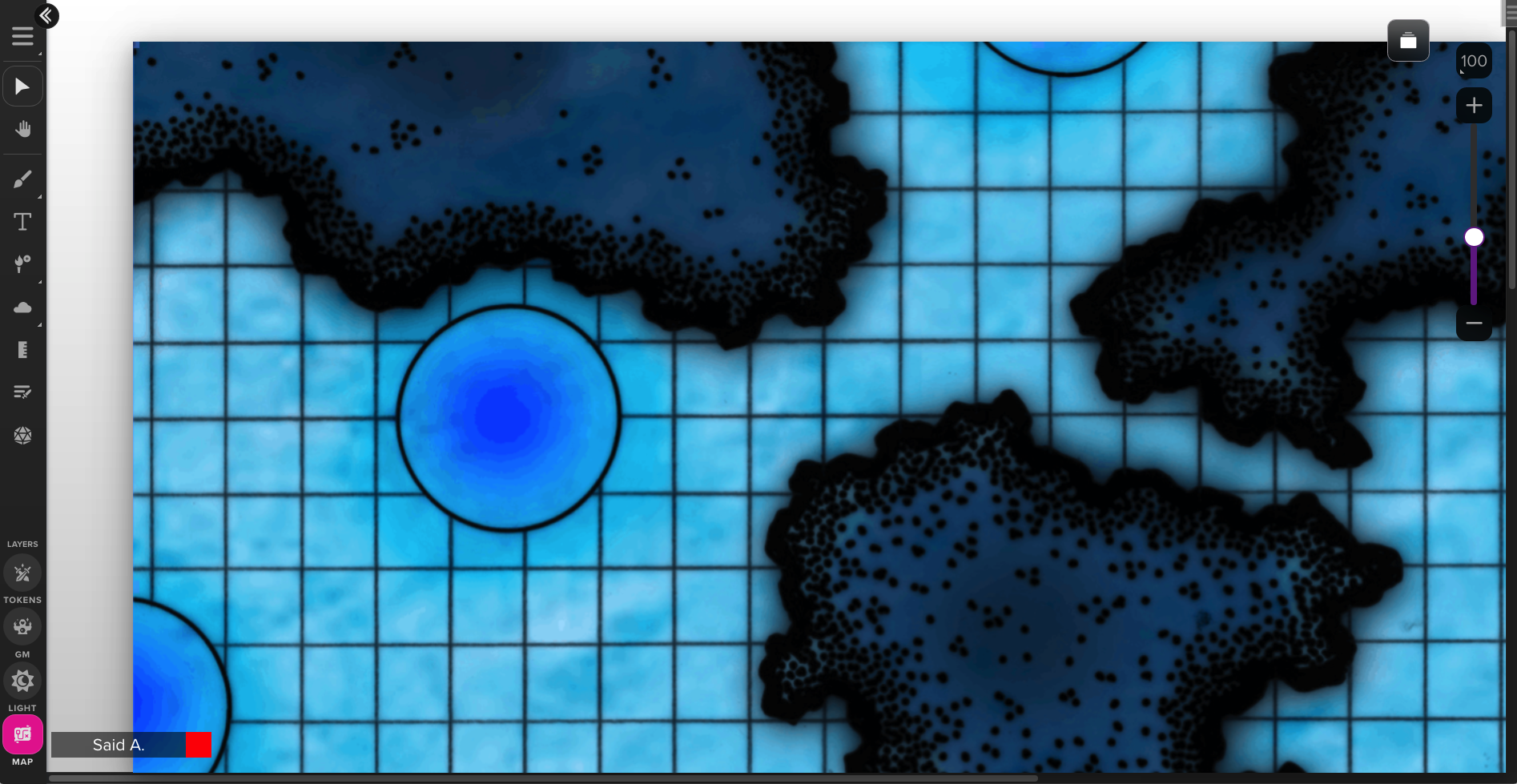
Consider the following map, with five areas, labeled A through E:
- A
- B
- C
- D
- E
Let’s call this zoom level 1.0 (not 1%, or 100%, but 1.0; we decline to specify how this zoom level relates to the map scale—we will simply refer to zoom levels by how much more or less zoomed in they are, relative to this zoom level of 1.0). We are looking at the whole map, displayed in its entirety in our viewport.
Now suppose that we want to take a closer look at area A. If we zoom in, here’s what we’ll see at a zoom level of 2:
- A
- B
- C
- D
- E
And at zoom level of 3:
- A
- B
- C
- D
- E
We’ve got a close-up of C, but what we wanted was a close-up of A! We could certainly pan over to A:
- A
- B
- C
- D
- E
Er… whoops. Didn’t quite pan in the right direction there… that does happen sometimes when you can’t see where you’re going! Ok, let’s adjust:
- A
- B
- C
- D
- E
There we go. We’ve got our close-up of A, but it seems like we had to take an unnecessarily indirect path to get there. And what if we have to zoom in further than just a factor of 3? We’ll be doing a lot of zooming and panning, zooming and panning…
This sort of interaction gets awkward and annoying very quickly. (It’s exacerbated by the poor implementation of the pan function in many VTTs. For that matter, some VTTs—incredibly—don’t even have a pan function! Of course, BigVTT will support panning, and we will approach the design of the pan function with the same care that we’re giving the zoom function—but even so, this awkward two-step of zoom-and-pan is decidedly sub-optimal.) Surely there’s a better way?
The problem here, to be precise, is a fixed zoom origin. In geometric terms, if we consider the zoom operation to be a transformation of the image, the problem is that the origin of the coordinate system in which the transformation is applied is fixed (usually—as in our example above—to the center of the viewport).
But there’s no reason to maintain this invariant. We can locate the zoom origin anywhere we like. One obvious approach (used, for example, in the image-focus.js library) is to place the zoom origin at the location of the mouse pointer, when using the scroll wheel / gesture to zoom in or out.
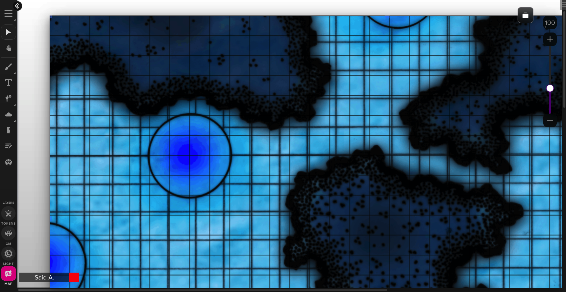
Thus, returning to our example above, we’ve got our zoomed-out map:
- A
- B
- C
- D
- E
Now, with our mouse pointer in the vicinity of A, we scroll to zoom in. Zoom level 2:
- A
- B
- C
- D
- E
Zoom level 3:
- A
- B
- C
- D
- E
Much better. (Some small adjustment via panning may still be needed—but, importantly, we will no longer see the thing that we want to zoom in on move entirely off the screen as we’re zooming. When working with zoom ranges of 100× or greater, this makes a tremendous difference in usability.)
Panning
Just as important as zoom, for moving around a large map, is the pan tool. Incredibly, some VTTs do not even have a pan tool or pan function at all (I truly cannot fathom what their developers could possibly be thinking); but even those VTTs that do implement panning tend to do it imperfectly. Let’s once again consider Roll20 as an example, which (as usual) is one of the best in the category, and allows panning via the following methods:
- select the pan tool (‘a’ hotkey), then click and drag anywhere on the map
- use the mouse wheel to scroll up/down (without the Option key held down) to pan up/down only (this method does not permit left/right panning)
- on a trackpad, use the scroll gesture to scroll in any direction
- middle-click and drag anywhere on the map
Once again, this is pretty good! In fact, if you’re using a trackpad, I’d say that this implementation is already perfect. But what about mouse users? Surely, VTT use is correlated with the use of large displays, which in turn is correlated with the use of desktop computers, which in turn is correlated with the use of mice. (And, anyway, I use a mouse with a desktop workstation, so that’s the important use case to support regardless of what anyone else uses.) Not everyone’s mouse has a middle button (on mice with a clickable scroll wheel, such as the venerable—and excellent—Logitech M510, depressing the scroll wheel acts as a middle-click; but scroll-wheel-clicking-and-dragging is also awkward-feeling and less convenient than it should be). And, needless to say, “switch to a whole different tool (i.e., a different mode) to pan the map, then switch back to what you were doing” is terrible for maintaining a smooth, efficient workflow.
Here (and in many other cases, as we’ll come to see) we can look to vector drawing applications (e.g., Inkscape) for inspiration. Such programs have a simple solution to implementing efficient pan functionality: make normal mouse movement (without any mouse buttons held down) pan the view so long as the spacebar is held down. We will adopt this method without modification.
But we needn’t stop there. One sort of UI interaction which is common to both web browsers and computer games of various sorts is the use of the arrow keys to pan the view. Roll20 does not have this functionality (nor do many VTTs), but is there any reason for BigVTT not to allow this? There is not.
(This is an instance of a general UX design principle: if there’s an obvious and/or familiar way to do something, and letting the user do that thing doesn’t interfere with any other UI functionality, then let the user do that thing. Why not, after all? The upside is that your UI will be easier to learn and more pleasant and efficient to use. The downside is… nothing, really. The only real reason not to implement such things as “let the user pan the view with the arrow keys” is laziness—or, if you want to cloak your failures in a veneer of respectability, “resource constraints”.)
Minimap
The minimap is a UI element well-known to players of a variety of genres of video games, including real-time strategy games like StarCraft:
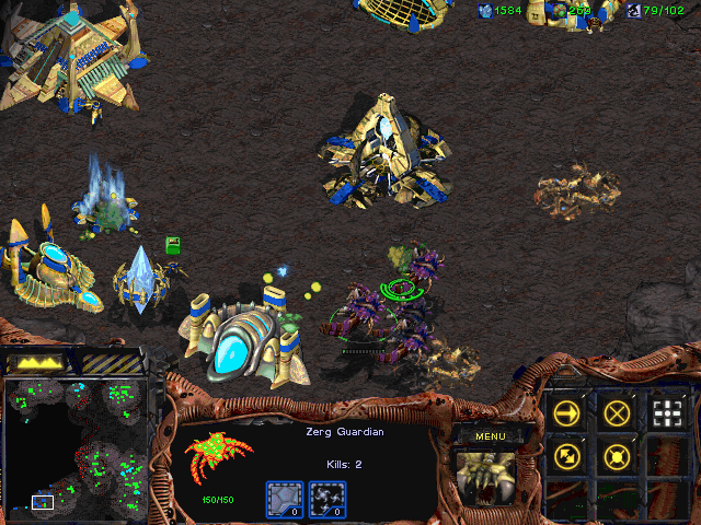
Figure 1. (Click to enlarge.) Minimap at the lower left.
MMORPGs like World of Warcraft:
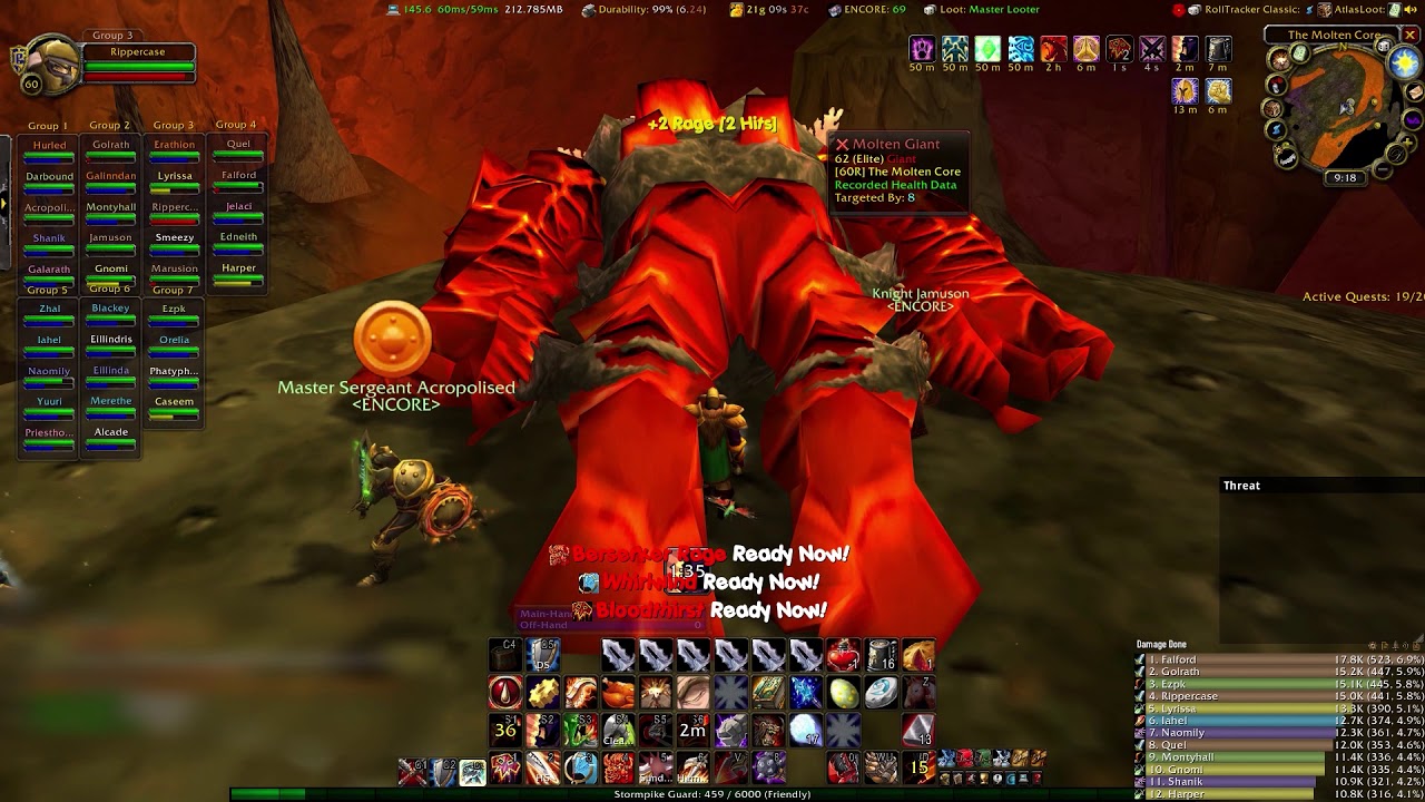
Figure 2. (Click to enlarge.) Minimap at the upper right.
Top-down space shooters like Escape Velocity: Override:
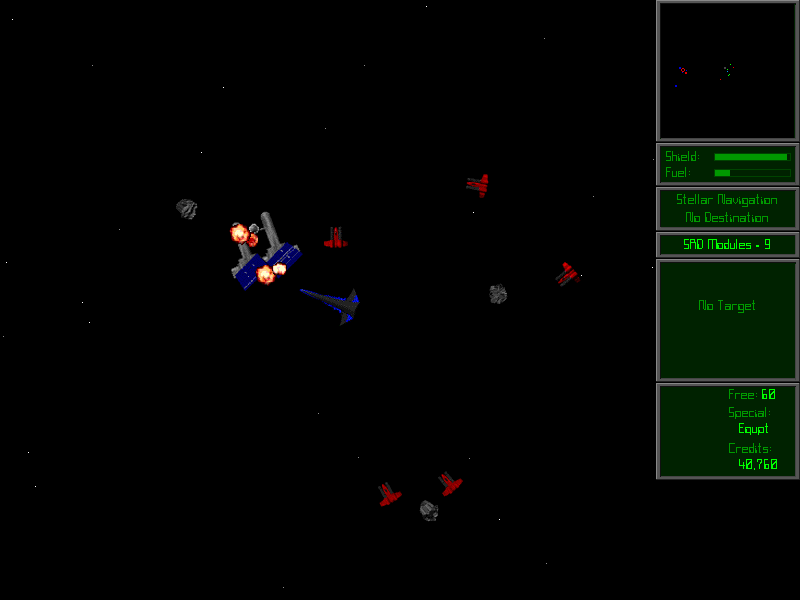
Figure 3. (Click to enlarge.) Minimap at the upper right.
First-person shooters like S.T.A.L.K.E.R.: Shadow of Chernobyl:
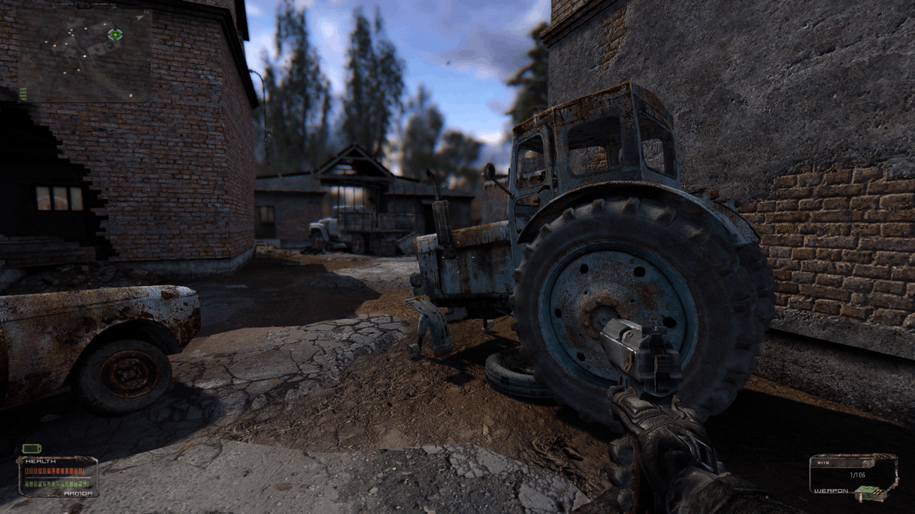
Figure 4. (Click to enlarge.) Minimap at the upper left.
The minimap has even started showing up in code editors, like Visual Studio Code:
Figure 5. (Click to enlarge.) Minimap highlighted at the right.
And Sublime Text:
Figure 6. (Click to enlarge.) Minimap at the right.
But I have not seen even a single VTT implement such a feature.
And yet it seems like such an obvious thing, doesn’t it? The concept is simple: show, in a small window or panel (positioned in a corner of the screen, and hideable by the user), a scaled-down version of the map. If the main view is zoomed in so that it shows less than the whole map, show a rectangular indicator on the minimap, outlining the part of the minimap which corresponds to that portion of the map which is currently visible in the main view. This will dramatically improve the user’s ability to orient himself and to navigate the map. Make the minimap clickable, and you’ve also got a quick way to jump to anywhere on the main map (much quicker than panning, or zooming out and then zooming back in to a different part of the map).
However, there are some nasty traps and subtleties lurking in this fairly simple concept.
What is a minimap, anyway?
First, if we take a closer look at the four examples above (figures 1 through 4) of minimaps in games, we can see that we’re actually dealing with two related, but distinct, concepts. On the one hand, we’ve got the minimap as used in StarCraft (and WarCraft III, and many other real-time strategy games): a scaled-down version of the entire game map, which at all times shows 100% of the accessible game world (in that particular mission or game), and never scrolls, pans, zooms, or in any way alters the mapping from minimap display pixels to map coordinates. A minimap of this sort also incorporates “fog of war” functionality (such that parts of the map which have not been “revealed” to the player in the main view are also “blacked out” on the minimap). (We will discuss the fog of war in much more detail in a later post.)
The other three game minimaps we looked at (in World of Warcraft, Escape Velocity: Override, and S.T.A.L.K.E.R.: Shadow of Chernobyl) do not show the entire map. Rather, they show a portion of the map, in an area of some constant (though possibly adjustable) size, centered on the position of the player (and thus which part of the overall game map is shown on the minimap is something which is constantly updating as the player avatar moves around in the game world). Such minimaps usually do not incorporate any fog of war functionality. (In many such games—including World of Warcraft and S.T.A.L.K.E.R.: Shadow of Chernobyl—there is also a separate “view map” function, which temporarily replaces the normal player view with a full-screen view of the entire map. In Escape Velocity: Override, it would, of course, be pointless to show “the entire map”, i.e. the entirety of the accessible star system—it would be overwhelmingly empty space—and the “view map” function there instead shows the galaxy map, with the current star system that the player is located in indicated thereon.)
We may observe that the latter three games share the property that there is a single, uniquely defined “player position” (which corresponds to the player character in World of Warcraft and S.T.A.L.K.E.R.: Shadow of Chernobyl, and to the player character’s ship in Escape Velocity: Override), and the primary game view always shows the game world from that position (while it may be possible to rotate, zoom, or otherwise reposition the camera, the player is not permitted to move the view to some position where the player avatar—whether person or ship—is not). Meanwhile, in StarCraft (and in similar RTS games), there is no single “player position” (the player controls various units, buildings, etc., which may be dispersed across the whole of the map), and the primary game view may be repositioned with respect to the map, independently of the location of any player-controlled units (although that view may hide non-allied units, or may show nothing at all, depending on whether the player has explored that location or has vision there).
It seems intuitively obvious that a VTT much more closely resembles the latter category of game than the former: there is no single unique “player position” (one might be tempted to point out that a player in a TTRPG usually controls a single player character, but that is a misleading coincidence—consider what happens if the character conjures a summoned creature, for example… to say nothing of the DM, who will routinely control arbitrary numbers of tokens), and there is no reason why we shouldn’t let the player pan the map view independently of the location of any player-controlled tokens. (The fact that we have definite plans to implement a fog of war feature is another hint—though only a hint!—that what we want is an RTS-game-style minimap, and not the other sort.)
Scaling problems
So, question answered, right? We’ll have a minimap of the sort used in real-time strategy games: the entire map shown at once, a rectangular indicator showing what part of the map is currently visible in the main view, etc.
Not so fast! Let’s take another look at that StarCraft screenshot:
Figure 7. (Click to enlarge.)
We can see, in the lower-left-hand corner of the minimap, the one-pixel-thick rectangular white outline which acts to indicate which part of the map is currently visible on the screen. We should be able to use this to calculate how big, in screen pixels, the entire map is (in other words, how large a display would we need, if we wanted to see the whole map in the main view at once, without needing to scroll). Now, given how StarCraft renders the game world, and the design of the game UI, measuring the vertical dimensions here would be tricky and error-prone… but measuring horizontally should be unproblematic. So:
- the game window is 640px wide
- the minimap is 128px wide (exactly one-fifth as wide as the screen)
- the map position indicator on the minimap is 20px wide
Therefore the main game view is currently showing 20px ÷ 128px = 0.15625 of the whole map; therefore the entire map used in the screenshot is 640px ÷ 0.15625 = 4096px wide. (So, with a monitor like this one, you could see this entire map without having to scroll—horizontally, at least.)
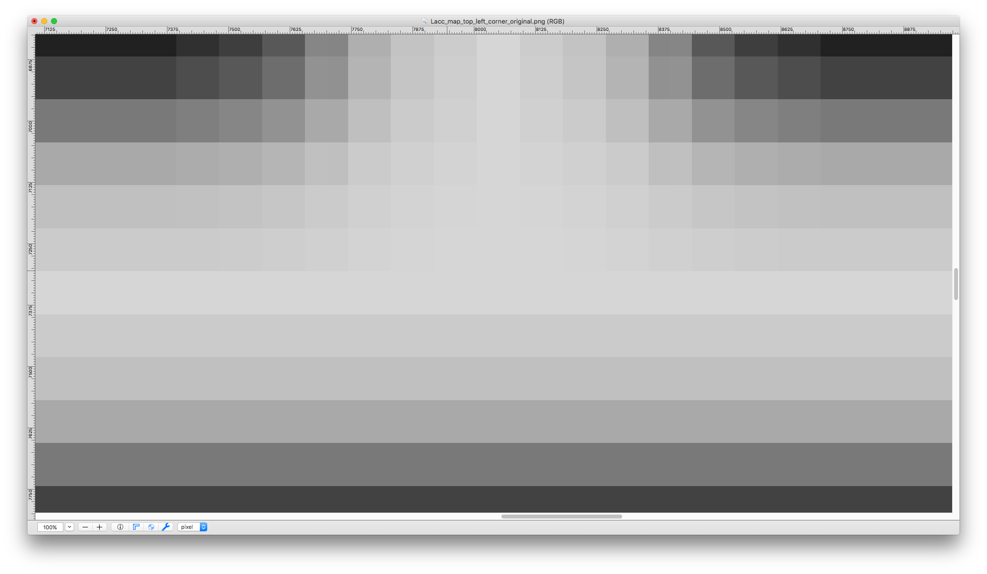
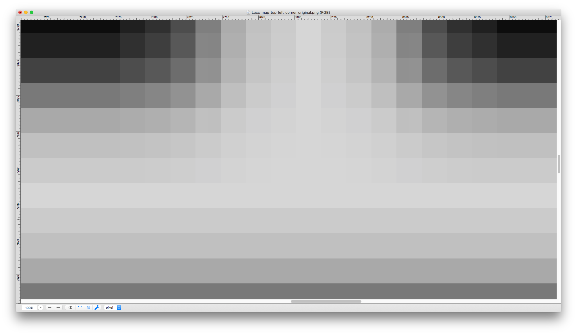
Now consider again our example map, which is 12,160 grid squares wide. Suppose that we render it at standard Roll20 grid scale (70 pixels to the grid square), and zoom in to our maximum permissible zoom level (200%, as we said earlier). The full map would thus be 2 × 70px × 12,160 = 1,702,400px wide. Let’s suppose that we are viewing this map on a standard 1080p display, in a full-screen viewport; thus the main map view will be 1920px wide. We’ll once again make the minimap one-fifth as large as the screen, i.e. 384px wide. Thus, the main map view in this case shows 1,920px ÷ 1,702,400px = ~0.0011278 of the map. Correspondingly, the rectangular indicator on the minimap (which shows which part of the map is currently visible in the main view) would have to be 0.0011278 × 384px = ~0.433px wide.
Hmm. That seems… less than useful.
It’s clear that a straightforwardly StarCraft-esque minimap implementation would not even be approximately or almost correct for cases like this; and it’s just as clear that no small adjustments to any of the numbers involved (e.g., “use smaller grid squares”) would fix the problem (because a small adjustment to some other number, in the opposite direction—e.g., an increase in the map size, or using a smaller viewport—would undo the fix). What we need is a principled approach which works well (as opposed to “almost kinda works ok-ish”) in “extreme” cases like this—after all, those are the very cases which motivated the design of BigVTT in the first place! Our solution, whatever it is, should not break down even under quite substantial shifts in map size, screen size, grid scale, etc.
So, how to do it? Let’s start by listing some assumptions and defining some boundary conditions. First, how big should the minimap display be, in terms of screen (or viewport) space? In the game examples that we looked at, above, the minimap ranges from being 9% as wide as the screen (in the World of Warcraft screenshot) to being 20% as wide as the screen (in the StarCraft screenshot). Our minimap will be easily hideable, and we will additionally try to have as little of the screen as possible taken up by UI elements; so we can be somewhat liberal in how much of the screen we devote to the minimap display. Still, too big would be bad (if it’s too big, the user will find the minimap obtrusive, and will prefer to hide it most of the time—which will reduce its value as a usability enhancement). Let’s pick 25% as our provisional value—our minimap will be no larger than one-quarter the width (and height) of the viewport.
Second, how small may the map position indicator on the minimap get before it’s too small to be useful? The indicator in the StarCraft screenshot is 20×12px large, but that would probably be too small for BigVTT—screens are both bigger and sharper (i.e., have a higher pixel density) these days, and we would not want to make BigVTT unduly difficult to use for users whose vision is not as perfect as it used to be. Let’s be conservative here, and double the width—we will say that the map position indicator should be no smaller than 40px wide.
What does that get us in terms of map size? With a 1920px-wide viewport, our minimap will be 480px wide; a 40px-wide map position indicator would thus mean that 40px ÷ 480px = ~0.083 or 1⁄12 of the map is currently visible in the main map view; and therefore, that our full map is 1920px × 12 = 23,040px wide. This is well short of the 1,702,400px width that our example map takes up at the maximum zoom level of 200% (we’re almost two full orders of magnitude short of the target). (Assuming the same map size in grid squares, a 23,040px total display width would mean that we are viewing the map at a zoom level of 2.7%, or ~1.9px per grid square.)
What to do? We’ve already established that we can’t adjust any of the key numbers on which this calculation depends (not in a direction that would help us, anyway). The only solution is to make a significant change to the way that the minimap functions.
Hybrid vigor
There are several possible modifications we can make to the minimap feature that would solve our problem, but here’s a fairly straightforward one. We will use a hybrid design: BigVTT’s minimap will be, essentially, a mix of the StarCraft-style “show the whole map at once” minimap and the World of Warcraft-style “show the player’s immediate surroundings” minimap.
To begin with, when the main map view is fully zoomed out, the minimap will show the entire map. (And the map position indicator will, of course, be as large as the entire minimap.) As the user zooms in, the map position indicator will shrink, until it reaches its minimum permissible size… at which point the minimap will also “zoom in”, dropping down to show not the entire map but only a fraction of it (with the map position indicator correspondingly resetting to a larger size). Zoom in further, and this process will continue, with the minimap showing a smaller and smaller (but still, always, larger than the viewport) portion of the whole map, each time a “zoom threshold” (i.e., a zoom level at which the minimap indicator has reached its minimum permissible size) is crossed. (The same process will work in reverse when zooming out, of course, until the minimap once again shows the entire map.)
In other words, at any given time, the minimap will show more of the map than the main map view does (except at the minimum zoom level, when the minimap and the main view both show the entire map). But the minimap will never show so much of the map that the map position indicator would be smaller than its minimum allowed size.
This will accomplish the goal of improving navigability and making it easier for the user to orient himself on the map, while robustly solving the scale problem, in a way that will never break, no matter how great the zoom range of any given map might be.
(There is another possible approach: showing multiple minimaps. That is: at minimum zoom level, we would show just the one minimap. When the user zooms in past the first zoom threshold—i.e., when the map position indicator would get smaller than its defined minimum size—we would spawn a second minimap, which would depict exactly the part of the map encompassed by the minimum-sized map position indicator on the first minimap. This process could continue indefinitely, spawning more and more minimaps. In practice, most maps and viewport sizes would result in perhaps three minimaps; even our example map, which is 12,160 grid squares across, would be fully handled with only four minimaps, at maximum zoom level. In any case, this approach, intriguing though it may be, will have to be left for a future version of BigVTT, as it is more complex to implement than the dynamically scaling minimap described above.)
View switching
A well-implemented zoom function, a useful minimap—these are things that benefit both the DM and the players, when using a VTT with a very large map. There are some features of the “large map affordances” type, however, which are primarily DM-oriented. One such feature is view switching.
Here we define a “view” simply as the combination of a zoom level and a position offset—in other words, some uniquely identifiable “viewport size and position” with respect to the map. So, for example, “viewing the entire map” is a view. “Viewing a region 5% of the map width wide, offset 31% from the top edge of the map and 12% from the left edge of the map” is also a view. In other words, zooming in or out changes the view; panning changes the view.
The question is: how do you transition from one view to another? Well, we just said it—zooming and/or panning, right? Now, suppose that you’re setting up the map (either during play or during prep), and you’ve got two locations of interest—let’s say, the part of the dungeon where the player characters are currently located, and some other area in the dungeon (where the PCs might soon go, perhaps). If you’re currently viewing one of these parts of the map, how do you switch to viewing the other part? You could pan over to it; or you could zoom out to where you can see both areas, then zoom in to a close view of the other area. (And, of course, the minimap will likely help you, in both cases.) But whichever method you use—suppose you have to switch back and forth, multiple times? Now continually zooming in and out, and/or panning (across, perhaps, a large stretch of the map), will introduce considerable friction into your workflow.
The solution to this is to have “view switching” functionality. This is not a single feature, but a cluster of related features, which all share the property that they involve “jumping” to some defined view with a single key command—without having to pan, zoom, minimap-click, or otherwise “manually” shift the main map view into the new position.
There are two basic categories of view switching features: built-in and user-definable.
Built-in view switching commands might include things like:
- “show full map”
- “go to location of last minimap ping”
- “go to location of the player character tokens” (repeated invocations might cycle between the PCs; or this command might show all the PC tokens on screen at once; or both)
- “go to location of the last-moved (or last-updated) token”
- “switch to previous view” (if the view was changed by some means other than simple zooming/panning)
User-defined view switching, on the other hand, may involve the ability to bind one of several shortcut keys (such as the numeric keys) to a specific view (or, perhaps, a specific token or group of tokens), and pressing the bound key would thereafter switch to that view (or to a view that shows that token or tokens).
As with the minimap, players of real-time strategy games will easily recognize this sort of feature. WarCraft III, for example, has the following view switching commands:
- Backspace to jump to your town hall (multiple presses to cycle between multiple town halls, if any)
- F8 to jump to an idle worker (multiple presses to cycle between multiple idle workers, if any)
- Spacebar to jump to location of last transmission
- F1–F3 (pressed twice) to jump to location of a Hero
- Numeric keys (pressed twice) to jump to location of a defined control group
The last one is, of course, an example of user-defined view switching; the other four are built-in view switching commands.
The long experience of RTS games pretty clearly demonstrates that a combination of built-in and user-defined view switching functionality vastly improves efficiency when navigating around a large map. This sort of feature is also fairly easy to build.
Map image scaling
This is actually two distinct, but closely related, questions: (a) what values are allowed / what variables are defined for determining map image scaling, and (b) what is the UI for controlling the values of those variables. (Even more so than view switching, questions of map image scaling almost exclusively concern the DM’s side of the table, since it’s the DM who sets up the map.)
Variables and values
What is “map image scaling”, anyway? Consider the following three variables2:
- the width of the map image, in either pixels (for an image in bitmap format) or arbitrary units (for a vector image)
- the width of a grid square, in image length units (pixels / units); a.k.a. “map scale”
- equivalently, the width of one map length unit (e.g., 1 foot) in image length units (e.g., 1 pixel)
- the width of a grid square, in logical display pixels3; a.k.a. “grid scale”
- equivalently, the width of one map length unit (e.g., 1 foot) in logical display pixels
The value of the first of these variables is a property of the image data, independent of any VTT functionality or even of any interpretation of the image. The second variable’s value arises from our interpretation of the image as a map that depicts some physical chunk of the game world. The third is a function of how we display the map on a screen. (Indeed, because we may display a battle grid without any map image at all, the third of these values does not even depend on there being a map image in the first place. Note that this third value is freely adjustable without altering either the image data or the mapping from the image data to the fictional reality which the image represents—this is what happens when we zoom the map view. However, we must still select a baseline grid display scale, which will correspond to a zoom level of 100%. This will allow us to create, import, and render bitmap assets—such as token graphics—in a way that will result in them looking good when displayed on screen.)
In order to usefully display and work with a map image, we need values for all three of these variables. We get the first value (width of the map image in image length units) from the image file—it has nothing to do with VTT functionality specifically. The second (width of a grid square in image length units) and third (width of a grid square in display pixels) are what we must specify—or, more precisely, what we must allow the user to specify, when importing a map image file and configuring a map.
(At this point it may seem like I am unduly belaboring a trivial technical point—making a mountain out of a molehill. The thing is, though, that in this part of a VTT’s design and implementation, it is very easy, via just a bit of carelessness or lack of thought, to make mistakes that, completely needlessly, dramatically reduce the usefulness and flexibility of the VTT app. I mention quite a few examples of such mistakes in my brief VTT reviews, and go into more detail on some selected examples later in this section. The point, in any case, is that thinking carefully and precisely about this aspect of the design will have outsized returns in how powerful a tool we end up building.)
Let’s take a look at some examples.
Example values
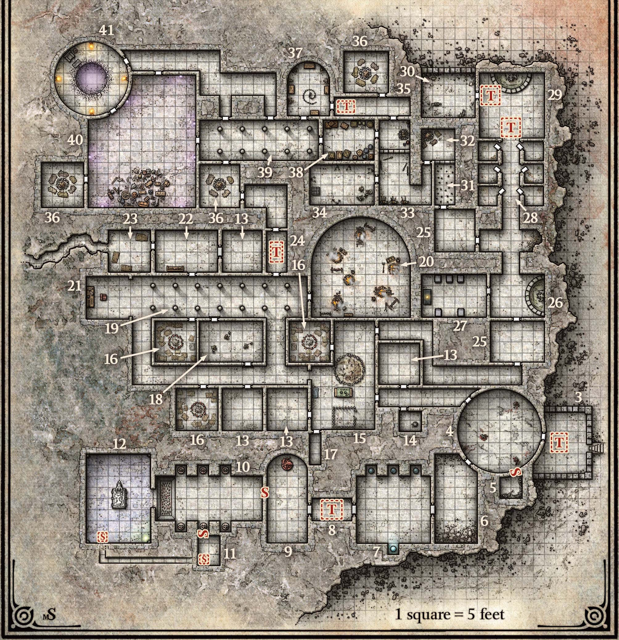
Figure 8. (Click to enlarge.)
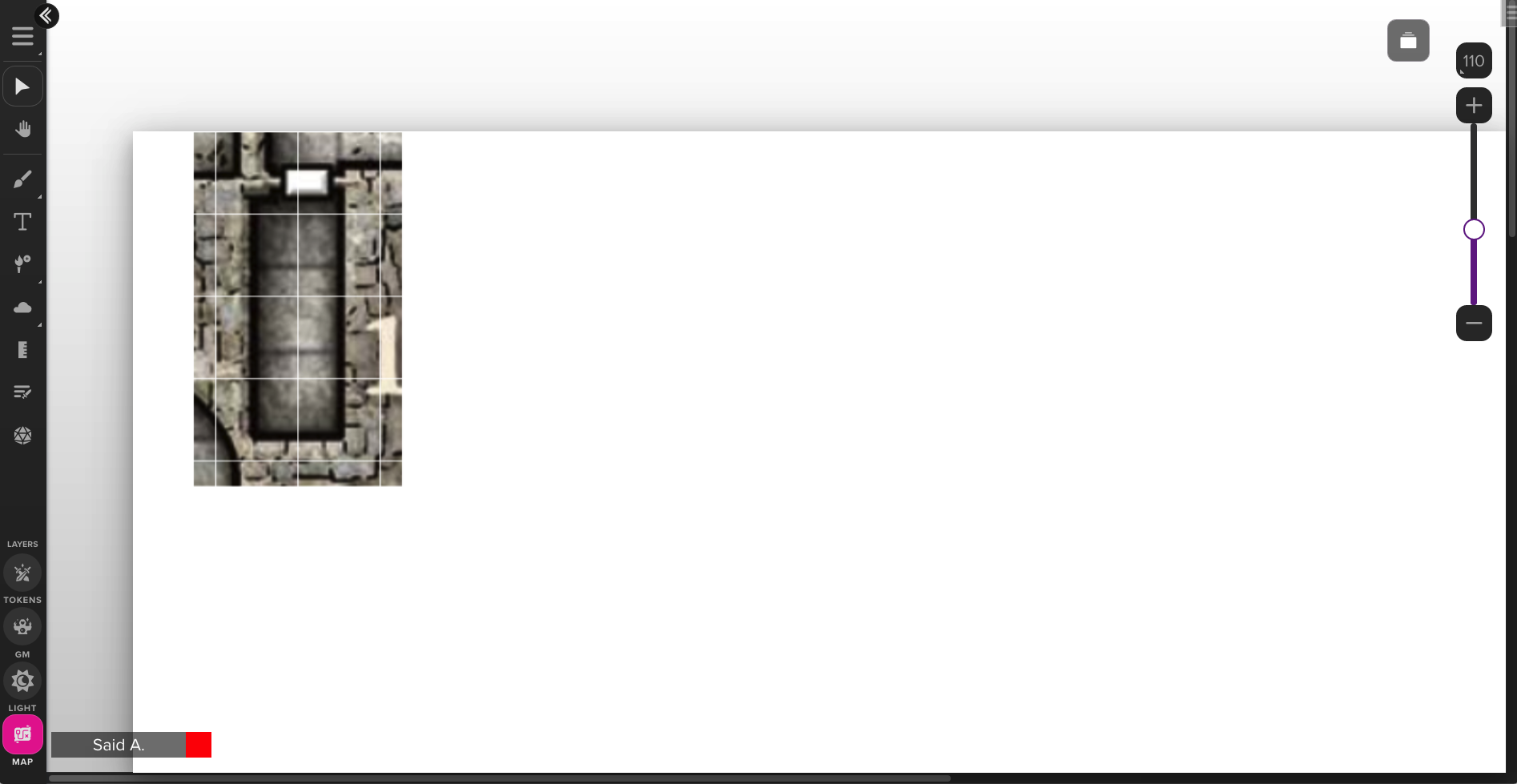
Figure 8 shows a map of the fortress level of “The Sunless Citadel” (one of the most well-known and well-regarded Dungeons & Dragons adventure modules). The image file encodes a bitmap (JPEG) image 2008 pixels wide—that’s our map image width.
The map scale of this map can be determined by careful inspection and measurement, and turns out to be 36 pixels per grid square.
(It may occur to us at this point that as TTRPG maps, especially dungeon maps, often come with a grid already depicted in the map image, it should therefore be possible—perhaps not always, but often—to determine the map scale from the map image automatically. And, indeed, some VTTs, such as Shmeppy, do try to do this, with the use of computer vision algorithms. Note that determining pixels per drawn grid square is only half the battle, because not every map will be drawn at the same grid pitch—i.e., mapping of grid squares to game-world length units like feet—as the grid pitch preferred by the user for the purposes of using the image as a VTT map. For example, given a map image with a 10-ft-square grid, we will want to import the map at a map scale half of that which would be inferred from the image. Inferring the grid pitch used in the map from text labels in the map image may be something which is now doable automatically via the use of AI tools, but, to my knowledge, no VTT app has such a feature yet.)
The grid scale at which the map will be displayed is, of course, entirely up to the user. The choice of grid scale depends on several factors. We want the map image, and any character token graphics, to look good when rendered on the screen. When using bitmap-format map images, if the image has a great deal of detail, textures, etc., we therefore would like the grid scale to be not too much greater than the map scale—otherwise, image scaling will blur (if using interpolation) or pixelate (sans interpolation) the map image, ruining the carefully drawn detail and textures and so on. Similarly, if the character token art for our Medium-sized (i.e., 5-foot-wide token) characters is drawn to a 100px scale, they won’t look very good when scaled down to 30px. The choice of grid scale also affects usability: make it too big, and you won’t be able to fit (at 100% zoom) enough content on the screen at once to be useful (you can zoom out, of course—but we’d prefer the 100% zoom level to be usable in play); make it too small, and players won’t be able to see what’s going on (again, you can zoom in—but… etc.).
In practice, choice of grid scale isn’t a very hard problem. There is a relatively narrow range of grid scales which work well (approximately 40px per grid square on the low end to perhaps 120px per grid square on the high end). Within that range, selecting a value has more to do with standardization and familiarity than any hard technical constraints. We must be careful when making assumptions here, as we’ll see; but, for now, we can take as a sensible default the Roll20 default grid scale of 70px per grid square. Note, again, that the grid scale may be set independently of any specific map image, or in the absence of any map image at all (i.e., it is a property of how the battle grid is displayed, no matter what map image underlies it).
So, when importing an image file to use as a map image, the key number that the user will need to specify is the map scale. In our Sunless Citadel example above, the map scale, again, is 36px per grid square—or, at it happens, approximately one-half of the grid scale (in other words, at 100% zoom level, the image will need to be magnified by approximately 2× for display). Now, consider this question: what is, in general, the range of permissible values which this variable may take on?
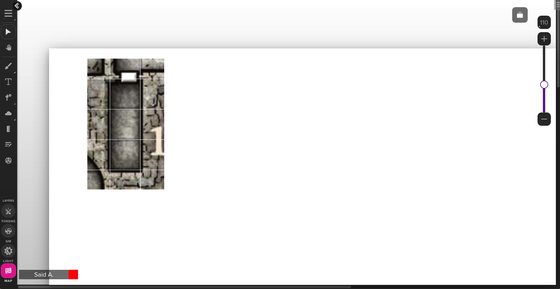
Can the map scale be larger than the grid scale? Certainly—here’s a map image drawn at 77px per grid square:
Figure 9. (Click to enlarge.)
And here’s one at 116px per grid square:
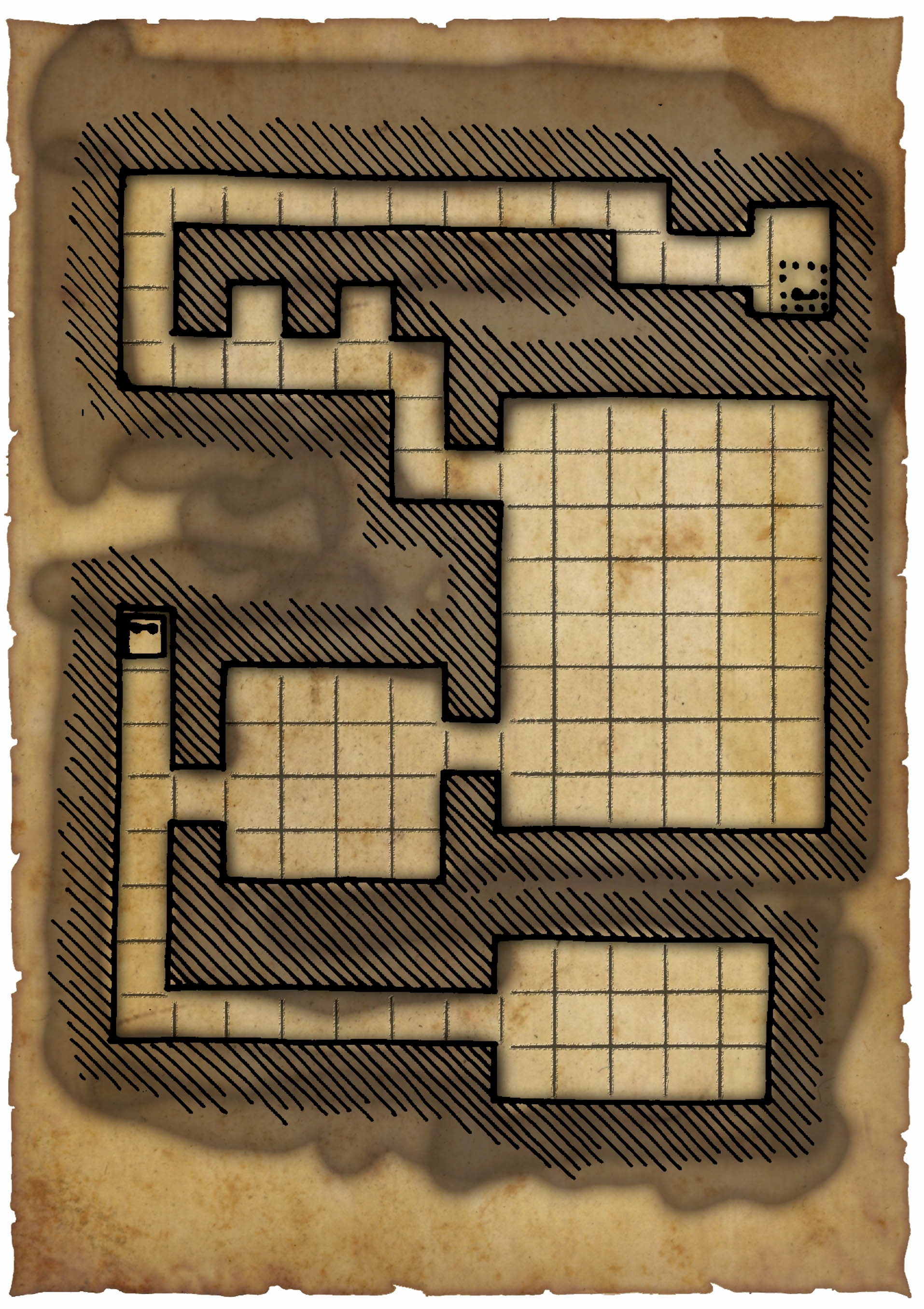
Figure 10. (Click to enlarge.)
Either map can be displayed at a 70px grid scale with no problems, of course.
What’s the upper limit? Should there be one? Well, if our map image is a bitmap, then as we increase the map scale, we’ll eventually find that either our map shows only a very small area (measured in grid squares), or else the file size is unmanageably large—or, even more eventually, both. But “eventually” is the key here; none of these problems are guaranteed to arise at a map scale of 100px per grid square, or 200px per grid square, or 300px per grid square.4
But recall that we’ve already decided on a vector format as the default for BigVTT map data (and even if we hadn’t, we’d certainly need to support a vector format as an option, else truly large maps would be impossible to create and use!). With a bitmap-format map image, the map scale is expressed in pixels per grid square—but there are no “pixels” in an SVG file, only abstract length units. Multiplying or dividing all coordinate values in an SVG file by 1000, or any other number, will make no difference to how the file is rendered, once it’s scaled to some display size. This means that, since the map scale of a vector-format map image is expressed in abstract length units per grid square, there cannot be any upper limit to the permissible map scale when importing a vector image file into BigVTT for use as a map image. A map scale of 10, or 100, or 1000, or 1 million length units per grid square—any of these should be permissible.
What about the lower limit? It’s clear enough that the same reasoning applies to vector image files as for the upper limit of map scale—there should be no lower limit at all. A map scale of 1 length unit per grid square is perfectly possible, or 0.1, or 0.01, etc. This suffices to answer the question, but note that the same is true even if we’re using a bitmap image file—there’s simply no reason to assume that a single pixel in the map image cannot represent an entire grid square, or even multiple grid squares (as we have seen). High-resolution map images are certainly common, but should not be required.
In summary, the map scale at which a map image file is used in BigVTT should be allowed to take on any positive value from arbitrarily small fractions to arbitrary large numbers. The only constraints should be those which are necessary to avoid integer overflow or similar technical problems.
The next question, then, is how the user can specify this value (or, to recall the caveat here, values—one each for the horizontal and vertical axes, as map images may not always be drawn with a precisely square grid).
Map scaling UI
There is a right way to implement a VTT’s map scaling UI, which easily and automatically avoids problems. And then there is a wrong way, which causes problems for no good reason. Needless to say, most VTT developers choose the latter.
The right way is the way that Roll20 does it:
Figure 14. (Click to enlarge.)
Figure 15. (Click to enlarge.)
Figure 16. (Click to enlarge.)
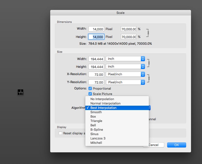
Simply let the user specify, in either grid squares or pixels, what size (width and height, independently) the map image should be scaled to.
The minimum value for both width and height is 1. (Obviously the map image can’t be drawn at less than 1 pixel in width or height.) The maximum is unbounded (or bounded only by technical constraints). Setting these values correctly automatically results in the map scale being whatever it should be, without the developer or the user having to think about “map scale” in explicit terms.
(Roll20 also has a “drag-the-selection-handles” feature, like you might find in any vector drawing program. This, too, is a no-brainer feature.)
This, on the other hand, is pointlessly wrong:
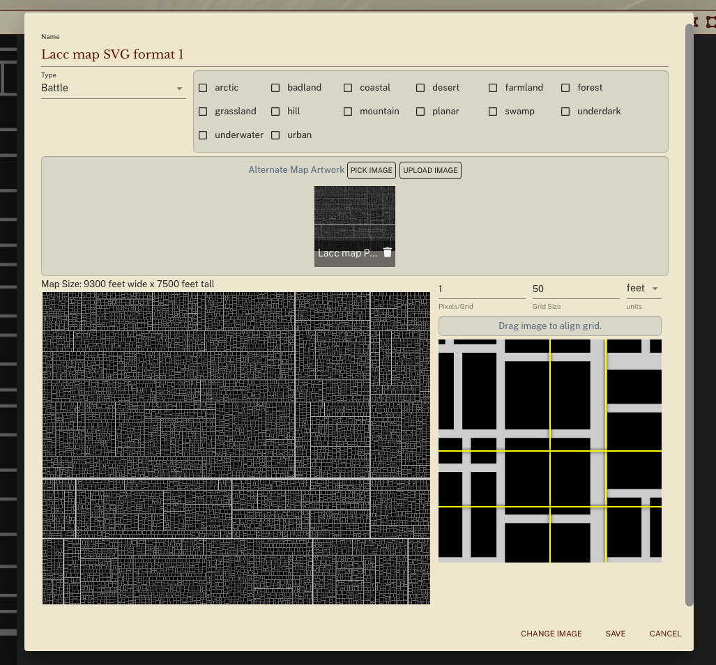
Figure 17. (Click to enlarge.)
Shard Tabletop lets you set a map scale, but the input field prevents you from entering a number lower than 1 or higher than… 370 (for some reason). This is an absolutely unnecessary limitation that simply does not arise with a Roll20-style map scaling UI.
This is extremely wrong:
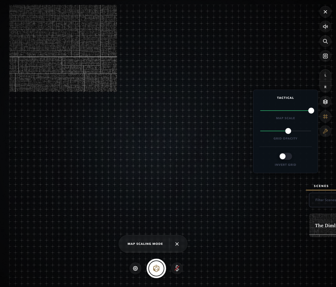
Figure 18. (Click to enlarge.)
Alchemy RPG features a slider to set map scale, which does not even show you the number that the slider position corresponds to (!), and the lower bound seems to be something like 135px (!!) per grid square. Just execrable UX design.
Another common pitfall which many VTTs stumble into is allowing the map image to be rescaled—but only via dragging, with no option to specify the width and height precisely via numeric input fields. I can only assume this is due to developer laziness, since the disadvantages caused by this oversight are extremely obvious.
Anyway, as I said, the correct design here is very easy: simply copy what Roll20 does, the end.
Interpolation
We have previously discussed the pitfalls of interpolation algorithms used in image scaling, and their consequences for the usability of bitmap-format map images at low map scales. Now, the principled solution here is one which we’ve already selected—namely, using a vector image format for our maps. However, if it is not unduly difficult, it would be better to also allow for the use of bitmap-format low-map-scale map images. The key question here is whether we can efficiently resize bitmap images without interpolation.
The answer is yes! The CSS property image-rendering: pixelated does what we want for <img> elements, and the imageSmoothingEnabled property does the trick when scaling image data in a <canvas> element. Both are widely supported.
What’s next?
Upcoming posts will discuss fog of war features, action history, BigVTT’s rendering system, and more.
1 We may run into hard-coded limitations imposed by web browsers, such as a maximum layout size of a document, or some such thing. And, even before we hit such limits, we will quite likely be constrained by the hardware on which BigVTT is run (both RAM limits and CPU/GPU performance difficulties may come into play here), though of course we will do our best to optimize the code to make efficient use of resources. Such things cannot be avoided; the key thing here is to impose no artificial limitations, i.e. we should have no restrictions on map size that are consequences of nothing more than poor UI design (e.g. a map pixel ratio slider that only goes down to 1), or of short-sighted choices in implementation (e.g. hardcoded limit values that are well short of those required by the browser). ⇑
2 In each case these can vary separately for the horizontal and vertical dimensions, but because these are orthogonal to each other—literally—we need not concern ourselves much with their interaction; so we will simply talk of single scalar values in each case, and assume that adding the second dimension works in the obvious ways. Where this assumption doesn’t hold, we’ll note it explicitly. ⇑
3 What is a “logical display pixel”? Here we are not referring to image pixels (which, confusingly, are sometimes referred to as “logical pixels”). Rather, we are referring to what the link in the previous sentence calls “device-independent pixels”, or what this article calls “points”, or what in web development are often known as “CSS pixels”. (The last of those is particularly relevant to BigVTT, as it is a browser-based app.) ⇑
4 How large a map scale can we expect, in practice, to always result in unmanageably large bitmap map image files? (The question is meaningless for vector graphics, of course.) Well, that obviously depends on what “unmanageably” means, but let’s arbitrarily pick a file size (let’s say, 5 MB) and a map size in grid squares (let’s say, 20×20), and ask: how large can we make the map scale while still fitting a map of those dimensions into that file size?
The answer obviously depends on what the map depicts, and how. Technically, this is a 20×20 map, at a map scale of 1000px per grid square:
Figure 11. (Click to enlarge, although there’s nothing more to see at a larger size.)
Yes, it is an absolutely uniform block of a single color (white), 20000×20000px in size—with a file size of 108 KB.
That’s an extreme (we could even say “degenerate”) case, obviously, but the same principle applies to more mundane cases. This is a 20×20 map:
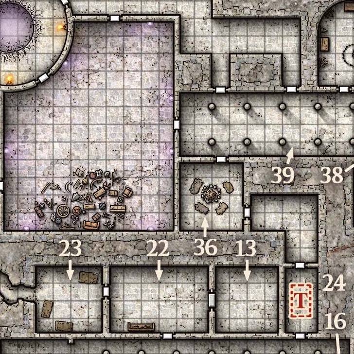
Figure 12. (Click to enlarge.)
And this is also a 20×20 map:
Figure 13. (Click to enlarge.)
The former is 355 KB in file size, with a map scale of 36px per grid square. The latter is 91 KB in file size, with a map scale of 132px per grid square. (Both are sections of real dungeons that I, personally, have used in games that I’ve run.)
So the answer is—well, probably nothing short of four digits, at least. ⇑


Recent Comments